

Introduction
In the realm of software development, effective documentation plays a pivotal role in facilitating understanding among team members and collaboration between teams in an organization. However, conveying the intricacies of complex systems through text alone often proves challenging. Nevertheless, even a simple diagram can serve as a small but significant step toward improving the comprehension of the service or application.
I wish to demonstrate a variety of diagram kinds, including flow diagrams, C4 diagrams, ad hoc diagrams, and sequence diagrams, along with tools for creating them. All examples will be in the restaurant table reservation context and follow the "diagram as code" approach.
Diagram as code
Diagram as code is a powerful concept that enhances the maintainability, transparency, and extensibility of diagrams within software development projects. By representing diagrams using code, developers can apply version control, automate generation, and integrate diagrams seamlessly into their development workflows.
By leveraging tools that align with the "diagram as code" approach, you can mitigate the risk of stale diagrams and ensure that your documentation remains accurate, up-to-date, and valuable for both current and future development efforts.
Ad hoc diagrams
Ad hoc diagrams are versatile tools for quickly sketching out the architecture or illustrating the high-level workings of a system from a big-picture perspective. In that diagram, the details are not crucial. Most importantly, you want to create it quickly and easily to convey your idea.
Here is an example of the high-level table reservation system architecture:
The tool that I currently use for it is: https://excalidraw.com/. It provides a library with a lot of icons and components.

In addition, it fulfills my expectations of being easy to maintain because of the possibility of saving a diagram as a .excalidraw file (a JSON format file).
Another tool that I found useful in the past was https://app.diagrams.net/. However, I think that https://excalidraw.com/ is a little bit easier to use and in my opinion, diagrams look visually better.
C4 model diagram
The C4 model (Context, Containers, Components, and Code) provides a structured approach to creating architecture diagrams that cater to different levels of detail and audience needs. I have already presented how to utilize these diagrams in one of the previous posts. A small appendix to the post: to render your diagram I use now structurizr CLI (executing a simple command: docker run -it --rm -v $PWD:/usr/local/structurizr structurizr/cli export -workspace myfile.dsl -format plantuml) instead of structurizr UI.
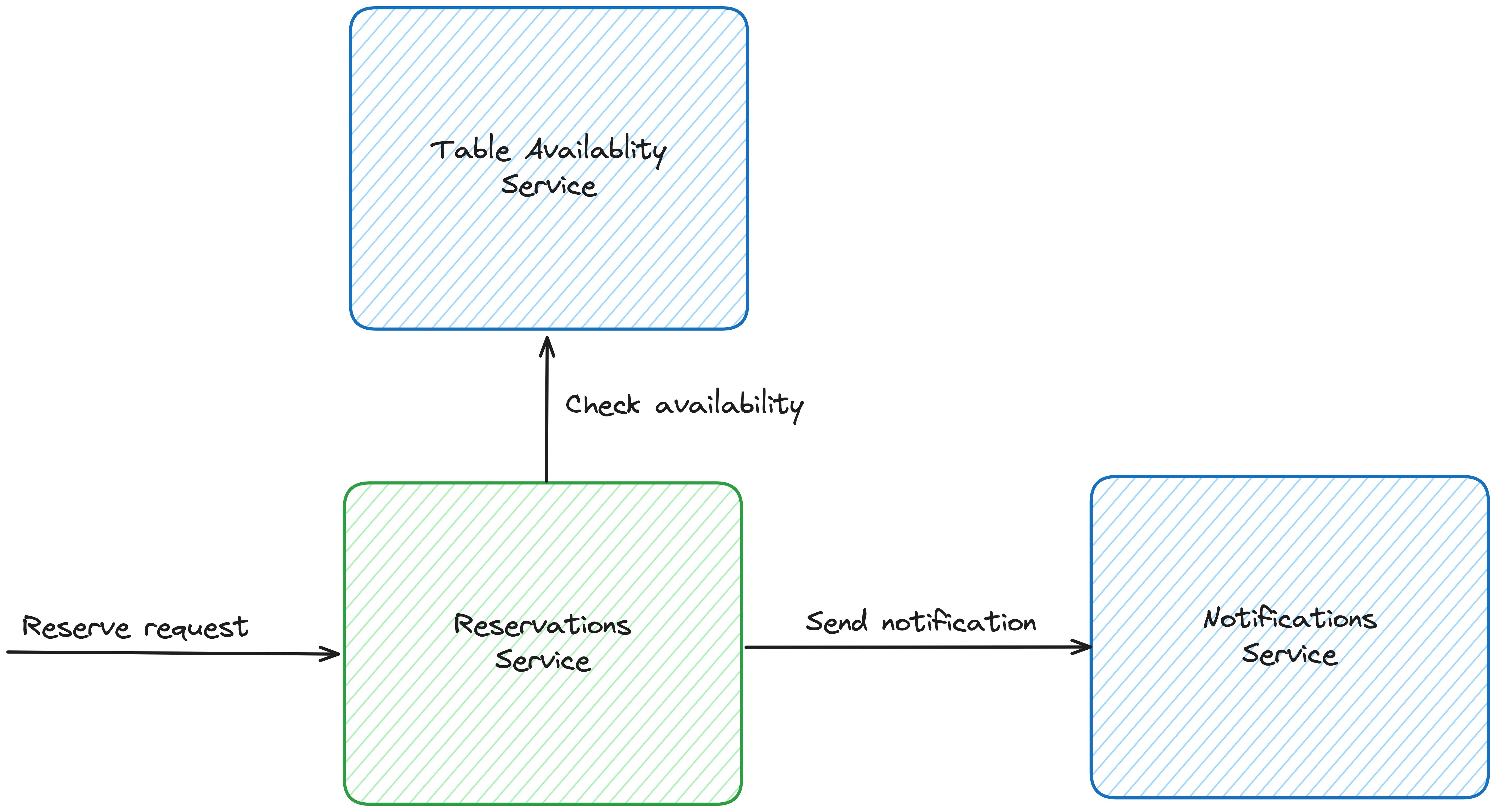
Sequence diagram
Sequence diagrams are powerful tools for illustrating detailed process logic within a system. They visually represent interactions between different components or actors within a system. Sequence diagrams maintain a temporal order of events, showing the chronological sequence in which requests (or messages) are sent and received. This helps in understanding the timing and synchronization of activities within the system. Unlike high-level architectural diagrams, sequence diagrams dive deep into the details of the orchestration logic. They allow developers to zoom in on specific interactions and examine the precise sequence of method invocations and return values.
There are many popular tools available for creating sequence diagrams, each offering its own set of features and capabilities. I like mermaid and plantuml the most because of their syntax simplicity and accessibility (both have live editors: https://mermaid.live/ and https://www.plantuml.com/plantuml/uml/).
Here is a sequence diagram for a table reservation happy path:

While sequence diagrams can indeed represent alternative paths, focusing primarily on the happy path helps keep the diagram clear and concise, making it easier to understand at a glance. Including every possible alternative or exception can quickly clutter the diagram and make it harder to follow, defeating its purpose as a communication tool.
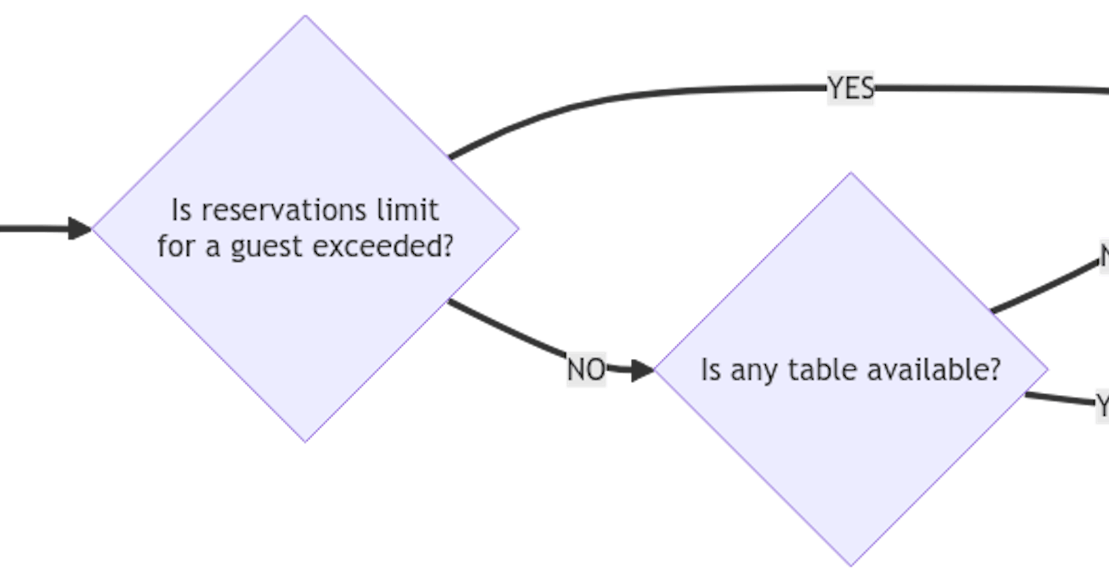
Flow diagrams
Flow diagrams are excellent tools for tackling many alternatives or complex business logic. They provide a clear visual representation of the logic and flow of a process, making it easier to understand complex decision-making and branching paths.
Here is an example of a decision flow on whether to reserve a table for a guest:
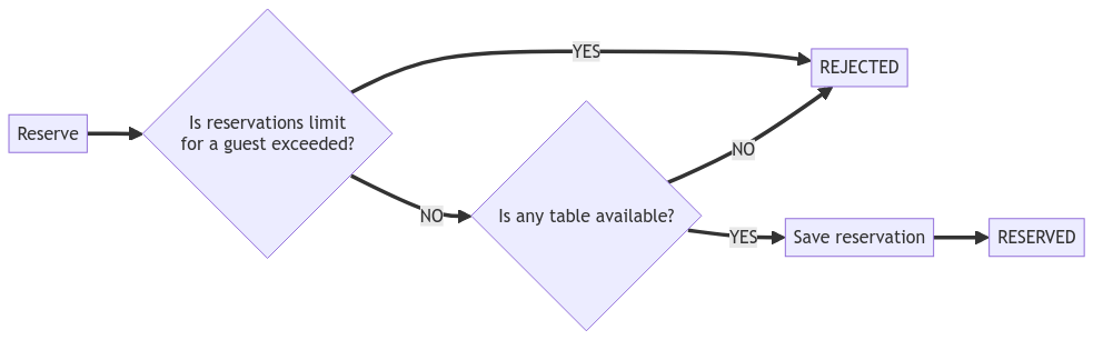
To create a flow diagram I usually use mermaid or plantuml.
Conclusion
Visual representations, such as diagrams, charts, and graphs, can improve communication and understanding in various contexts beyond documentation. When words alone struggle to convey complex ideas or relationships, visual aids provide a powerful alternative by presenting information in a more intuitive and digestible format.
Moreover, the concept of "diagram as code" enhances the living documentation approach by making it easier to keep documentation up-to-date and aligned with the system's current state.
Of course, there are many more kinds of diagrams that can be helpful, but I thought the four mentioned above were the most clear-cut and practical.
The source code for all the above diagrams can be found here.